elementary OS 7: is it enough to make me switch?
elementary OS was the first Linux distro I really fell in love with. Since then, it's been surpassed by GNOME and KDE, but can elementary OS 7 win me back?

elementary OS 7 is finally here. It took a year and a half from OS 6 to OS 7, and a lot has changed in the Linux desktop space since then. When OS 6 released, it was by far the smoothest and most polished experience you could find on Linux. It might have been too simple for some people, but no one could argue how well designed and focused it was. GNOME and KDE have since improved by leaps and bounds, and made strides to support the latest Linux stack, like Wayland, Flatpak, portals, and more, basically relegating elementary OS 6.1 to an also ran that was playing catch up.
So, is OS 7 enough of a leap forward to make me ditch GNOME and KDE, and move back to my first real Linux love? We’ll look at what’s new, and I’ll tell you at the end if it was enough for me to switch back, or not!
And, of course, if you like videos, well, here’s this article, in video format:
The basics
Let’s start with a few basic details about OS 7 as a distro.
It’s based on Ubuntu 22.04.1, which is about a year old at that point, it’s an LTS release, so don’t expect the very latest packages in the repos, or the latest kernel and drivers. elementary OS 7 will get the hardware enablement stack as Ubuntu releases it, so it will get more hardware support over time, and newer kernels, but a bleeding edge distro this is not.
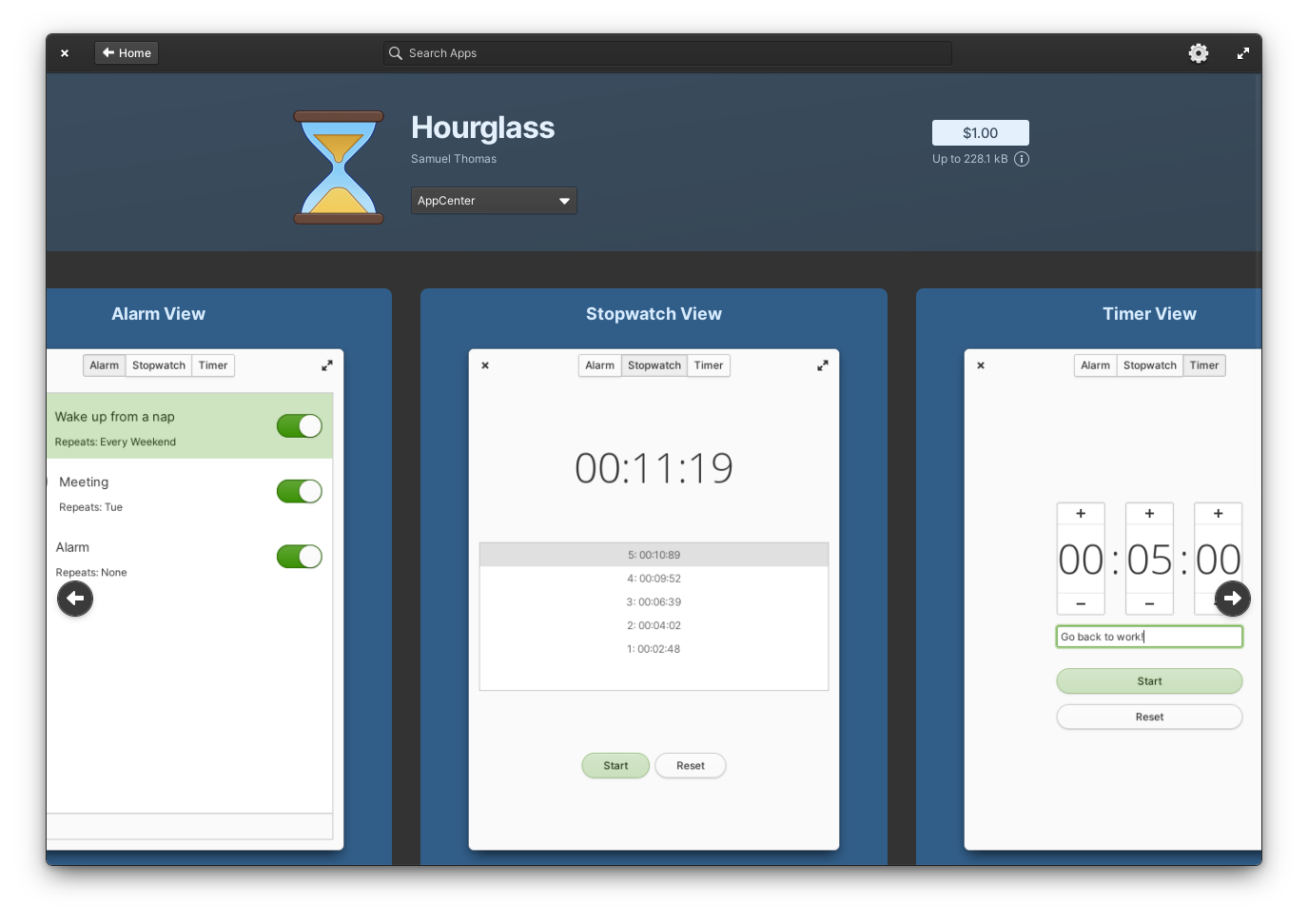
It still uses its own desktop environment called pantheon, and its own applications, developed for elementary OS, and it’s still available for free, or you can pay what you want to get it.
It’s codenamed Horus, which, you know me, I’m a 40K fanboy, and so I have to call it. That’s HERESY.
Installation and first run
Installing OS 7 isn’t different from installing OS 6, the installer looks the same, and feels the same. You still get a few changes here and there, like less invasive messages to tell you to plug in your device for example, you’ll get a recap page before installing that will let you know what to expect, and also warn you about installing in a virtual machine, because obviously it’s not the same experience as a real install.
Which is why I always test and record the distros I show on the channel on a real laptop, not on a VM. A distro first look or review done in a VM is pretty worthless in terms of how things feel. But also, I lied, I record the installation process in a VM. Because, well, that’s easier and I’m lazy.
The installer will also auto detect if you try and click using the right mouse button, and allow you to change to a left handed configuration, there’s a new page letting you connect to the internet if you’re not already, and that’s about it. Still no partitioning, you can do it using Gparted, but the installer doesn’t have these capabilities.
The onboarding process added a few things as well, like the ability to select the auto dark and light theme depending on the time of day, or to configure automatic updates, but that’s about it.
Nothing really changed here, but it didn’t really need to, the install process and first run were among the best and most user friendly, and it’s still excellent.
Look and feel
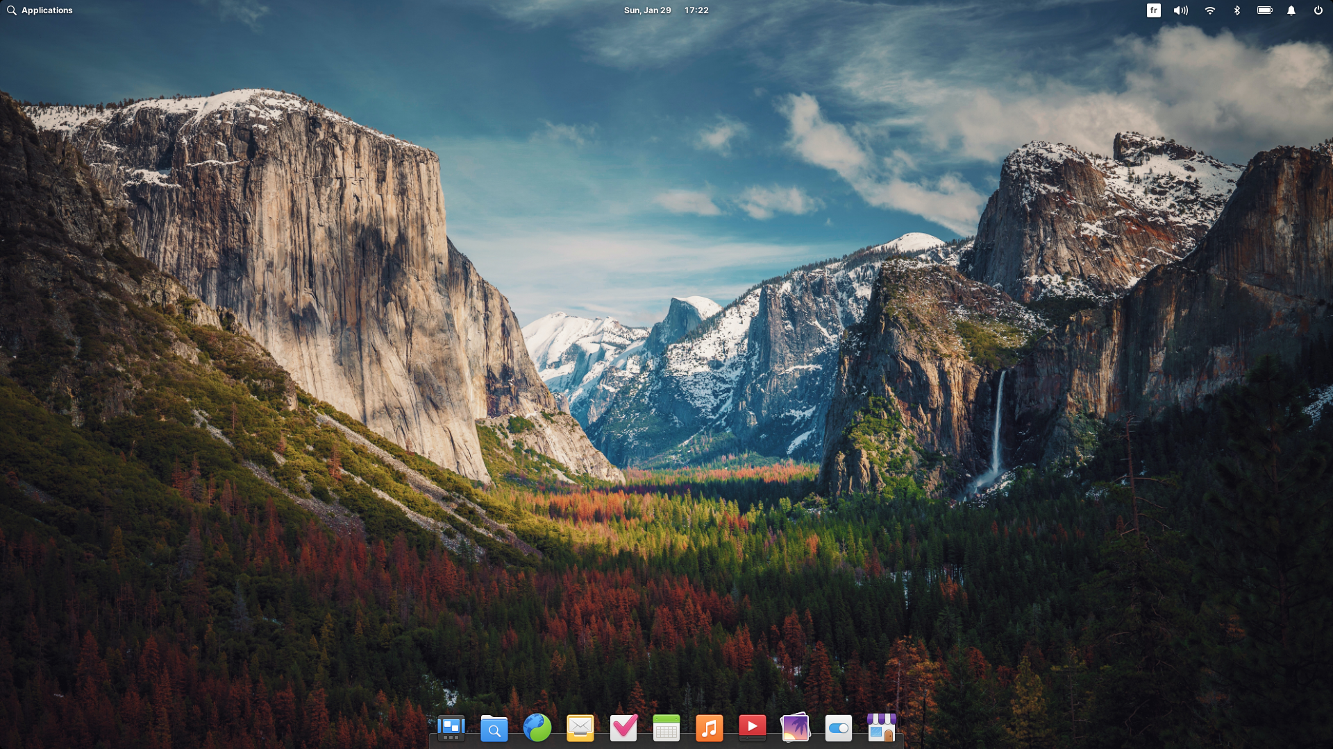
In terms of look and feel, there’s no 2 ways about it, it looks identical to elementary OS 6.1. You still have the top panel, and the dock, the theme is the same, you have the same accent colors and dark mode, no noticeable changes there.
The only thing that changed is the icons. You might be forgiven to think they look identical to the previous release, but they’ve been tweaked or redone so they all follow a more coherent size and shape, so you shouldn’t have tall icons sitting next to your squat square ones in your dock. Small changes have been done here and there on the toolbar icons as well, but generally, the art style is the same.
It’s colorful, a little bit 3D / skeuomorphic, I personally like it, I think it has passed the point where it looked old all the way to the point where it feels fresh again compared to all the flat bland looks we have these days.
The general theme is also identical, although they moved to GTK4 for a few of their applications, like the calculator, the sideload app, the music player, the shortcuts list, or the onboarding app. The porting efforts are still under way, and the bigger apps like the file manager for example are still GTK3, and they’ll be ported over to GTK4 over the lifecycle of OS 7.
Which, hopefully should also bring more features. Because, yes, elementary OS follows a model similar to KDE Neon: you get a stable base that doesn’t really change all that much, but the desktop itself and its apps gets updates consistently. Not exactly a rolling release, maybe more of a dragging release? It doesn’t roll, but it still moves? We need a name for that.
App Center and Flatpak
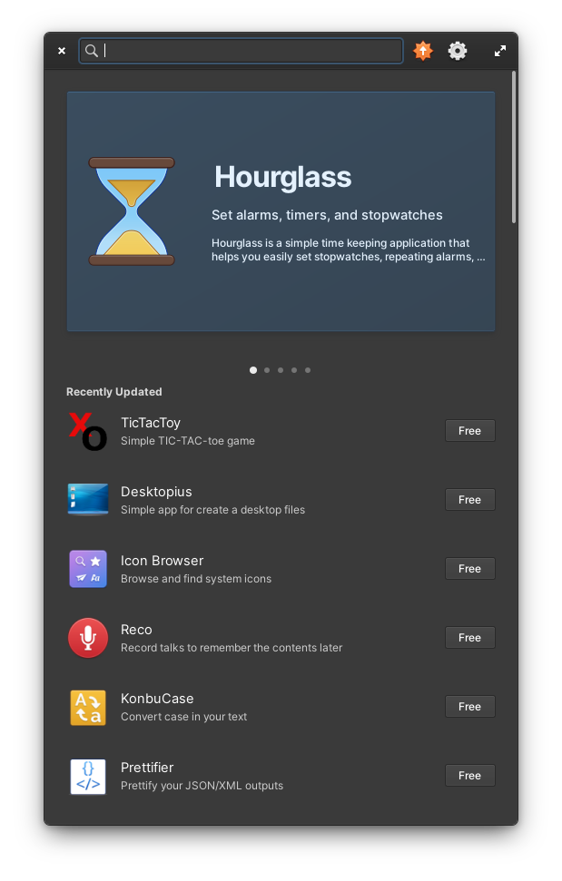
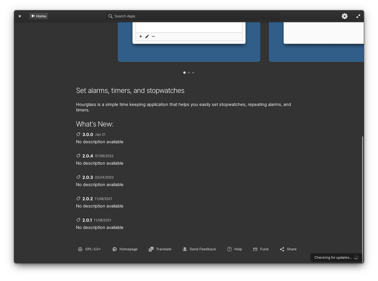
Let’s talk AppCenter, elementary OS’s graphical software store. That thing was miles ahead of the competition when OS 6 released, it looked better, it was faster, it had more information about apps, it let you pay what you want for apps, or get them for free, it was just great.
When a company like System76 decides to use it for their own distro that they ship on laptops they sell, you know App Center was doing something right. Well, if you don’t count the decision to only display elementary apps in the store, and not apps from the repos, or the decision to not add flathub by default. That’s not so great
Since then though, GNOME Software and Discover have caught up, and so OS 7 implements a few changes of its own.
First, the store is now responsive and works better on small sizes. It’s good for tiling it on one side of the screen, but it also means it sorta looks weird, like with the search bar that feels way too big at regular window sizes.
The headerbar was redone, with a permanent “updates” button instead of using the “installed apps” tab, and a settings icon to enable auto updates.
In application pages, you now get bigger screenshots, something that’s still an issue in GNOME software where they’re way too small, and they’re surrounded by bright accent colors, and even captions to describe what the app can do, it looks good and it’s a joy to use on a laptop with super precise touchpad gestures that follow your fingers
AppCenter still feels better than GNOME software on a laptop, just because you can go back and forward using your touchpad, you never have to aim for the back button. It also feels faster. A lot faster.
OS 7 adds a few mentions on app pages as well, like an “outdated” tag if an app hasn’t been updated for OS 7. You’ll still be able to run it, because it uses flatpak, so apps from OS 6 will run on OS 7, and vice versa, but it’s an indication that the developer hasn’t yet followed through with the release, and you also get more update notes, with up to 5 versions, so you know if the app is actively maintained or not.
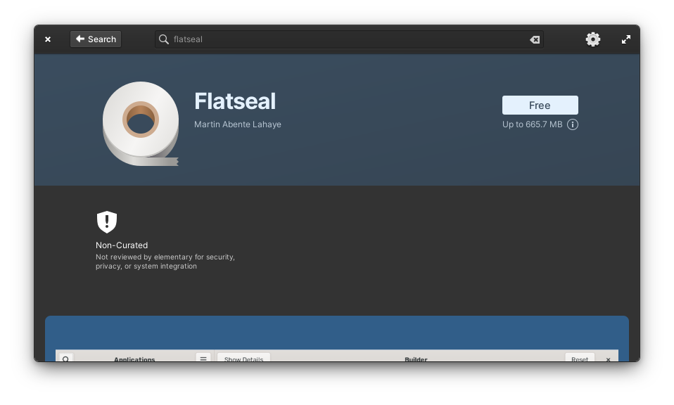
And now for the not so good stuff on the App Center. First, it still only displays elementary OS apps by default. You don’t have flathub, you have to add it yourself.
You still get that small text when your search returns nothing, with a link to flathub, and the sideloap app will let you add it graphically, but it still sucks that there’s no simple one checkbox option to add it at install.
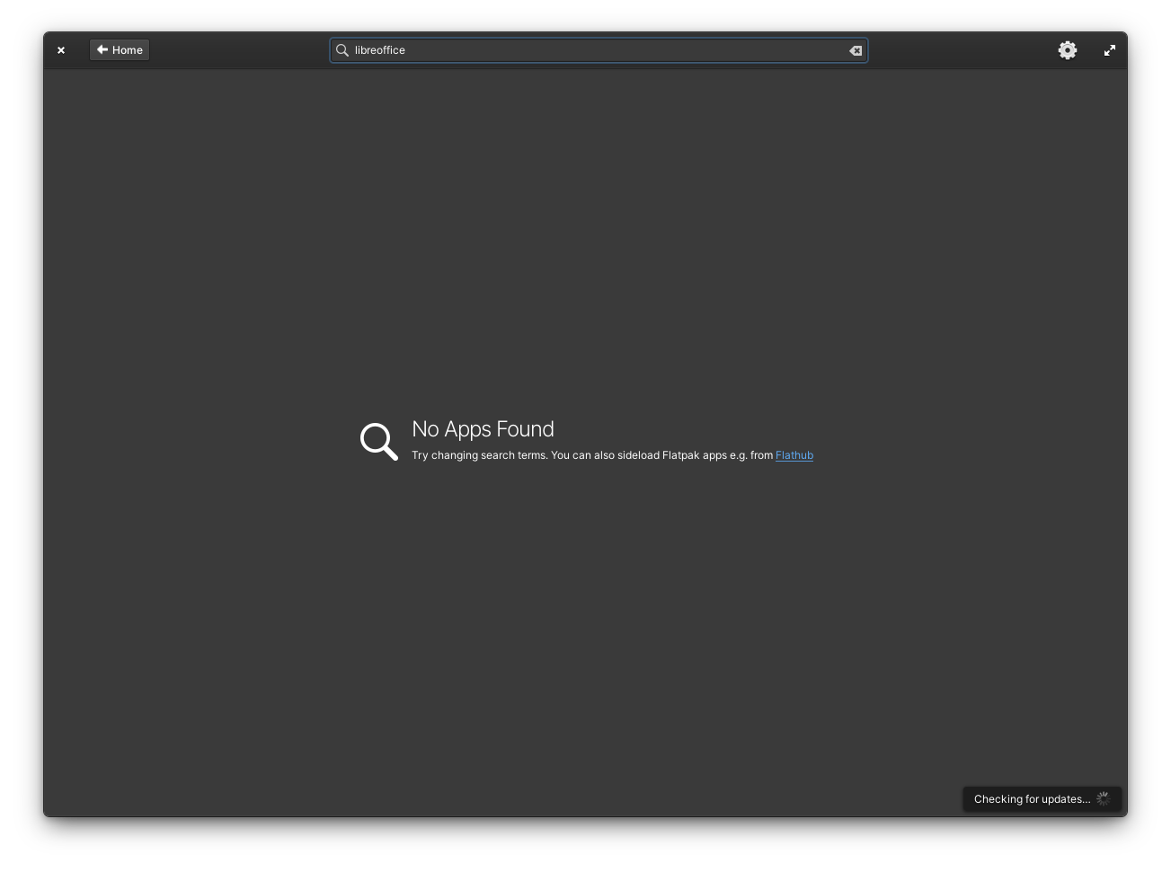
Also, OS 7 still has no graphical access to Ubuntu apps from the repos, so if you want to install them, it’s command line only, or you’ll have to install a second app store, like gnome software. I guess it also means you don’t get snaps on the desktop which I can’t say I’m disappointed by.
Third, the app pages are now way less detailed than the ones you’ll get in GNOME software or Discover. No list of permissions for flatpak apps, no age ratings, no safety indication, no details about the license, and the app update info generally seems less complete than on GNOME software.
App Center had the edge in terms of how it presented apps, but it’s been surpassed, and these features are expected when you’re basing yourself on Flatpak: you have tons of standardized info to pull from, and OS 7 just doesn’t do it, or doesn’t present it as well. It’s not a bad experience, but it’s not as good as what you’d find on other desktop environments.
Updates and Sideloading
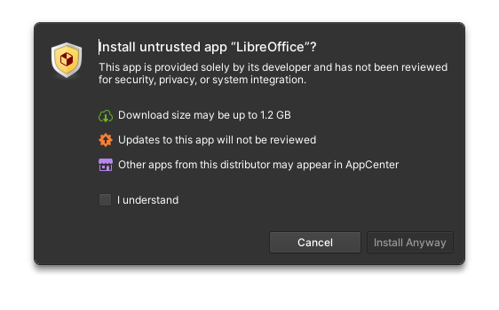
That brings us to “sideloading”, which basically means getting an app from Flathub and installing it manually. You can still do that, just by downloading an app from the Flathub website for example.
This will add that big remote to your sources, and you’ll have access to all Flathub apps in the app center afterwards.
Now, once you added that, you won’t get a dialog for each app you install from it, telling you it’s not curated, you just get a small tag in the app’s page, so there’s less friction.
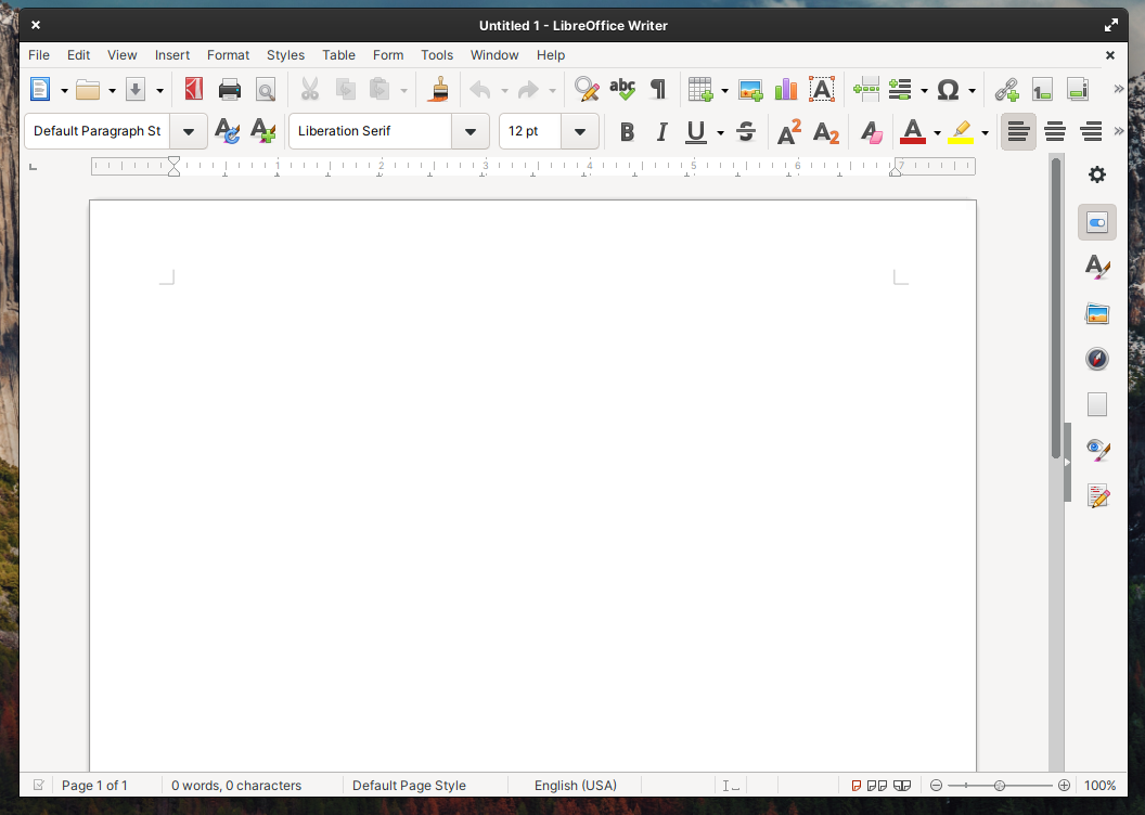
Applications installed from Flathub will not reflect the elementary OS theme by default, so they’ll look a bit out of place, and they won’t follow your accent color, because there’s no standard there yet either, and they might not follow your dark mode preference either, depending on the app, for example, libreoffice doesn’t.
So, in the end, adding Flathub is very easy, graphically or otherwise, but by default, you simply shouldn’t force users to only have access to a small app ecosystem that doesn’t have crucial apps, like an office suite or browsers that people actually use, like Firefox.
Well, ok, maybe not firefox, people don’t really use it anymore, unfortunately, but you get my point: it’s simply a bad decision to not have the apps people will ALWAYS want to use directly available by default.
Apps
Let’s look at the updates to the applications!
First, you get GNOME Web, ported to GTK4, with a much faster webkit engine. It supports creating webapps, that will show up in your elementary OS Menu, and for me, it’s night and day with the previous version, because I can finally play Youtube videos, which never worked before on epiphany / gnome web for me, on any device.
It’s still very smooth to use, with touchpad gestures to go back and forward, and it’s now a pretty good browser I must say, apart from extension support, which is being worked on, but isn’t really there yet.
The mail client also received a lot of love. You still need to use the online accounts feature to add your email account.
And on a side note, these online accounts are still very limited: no Nextcloud, no Google, no Microsoft, you basically just get IMAP and CalDAV, and you have to enter all the details yourself. These online accounts are much, much better handled on GNOME or KDE.
Once you have your account, you’re treated with a refreshed user interface, that should make its way to other elementary apps as well: the icons are now part of the content, and not split in a separate headerbar, which makes the app look cleaner and less heavy. Office 365 accounts will now also appear in the unified inbox. The app is also a lot more stable: on OS 6, it crashed and froze and failed to display email all the time, and it’s much better in OS 7, but it still lacks a few key features, like the ability the create labels or folders, handling signatures and stuff like that.
It’s now definitely a usable simple mail client, but it won’t work for people who want to use it in the office.
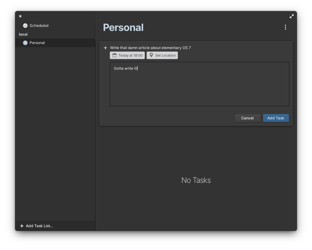
The tasks app was pretty barebones in OS6, it was a bit buggy, but now it’s much improved. You can create new task lists offline, and they’ll sync to your CalDAV account when you get back online, if you have such an account configured, and tasks that reach their due date can now send notifications.
I’ve been using Endeavour as a task manager on GNOME, and it’s still much better. It looks just as simple, but it does a lot more, especially with its various views, like “today”, “this week” and stuff like that. Tasks feels too simple by comparison.
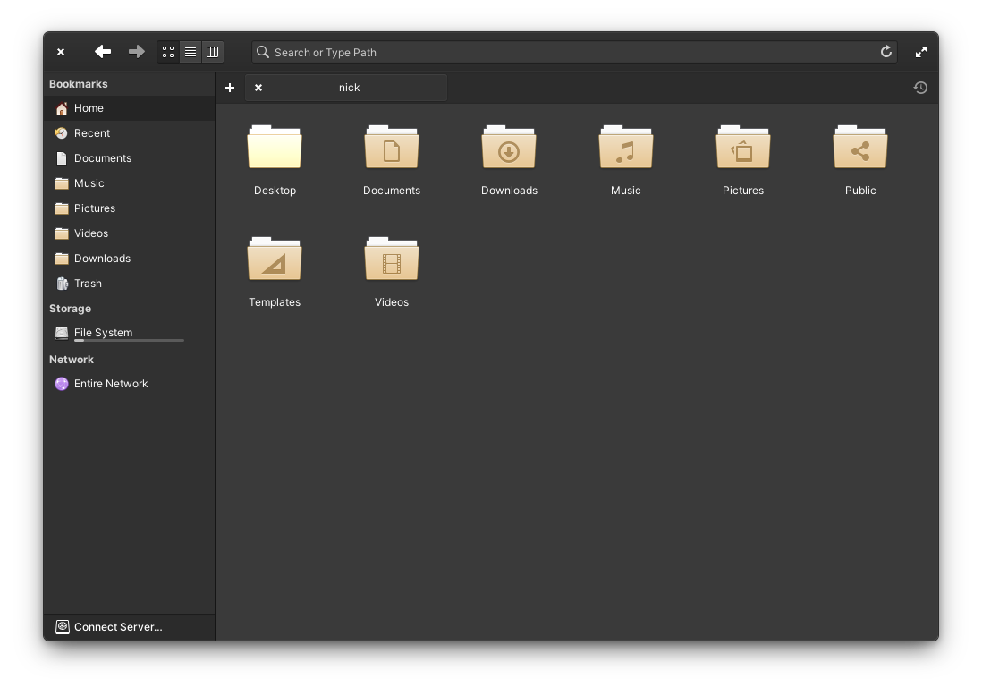
The file manager now lets you select folders by clicking on them, when before a single click would open them. You can turn that option on in the context menu. That’s about all the changes in that app, and it’s still super simple, and a lot of people will probably find it too basic for their needs.
For me, it’s the lack of Nextcloud integration that kills it: I can’t right click a file and get a shareable link, and that’s something I do every day on GNOME and KDE.
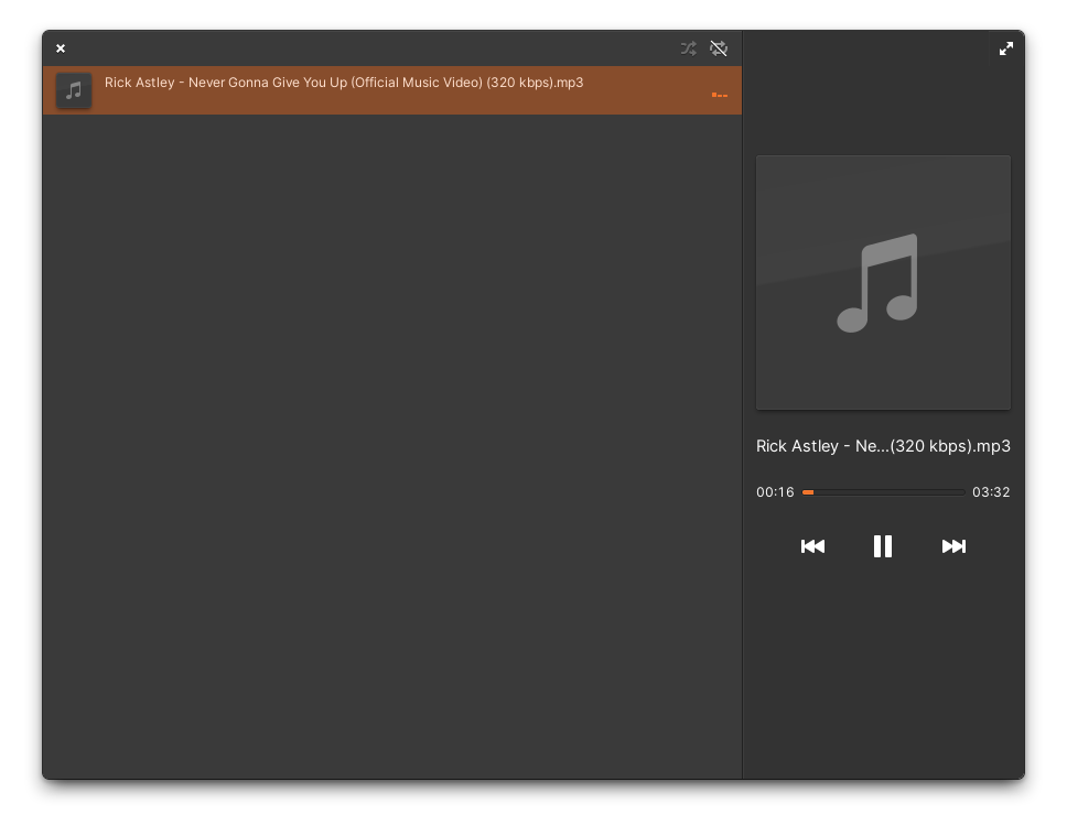
The Music app is the one that changed the most. It’s been rewritten, and it’s no longer a music collection manager: it’s just a player, with a queue. You just add songs, and they play, and that’s it. No management of albums, artists, genres, or stuff like that. It looks beautiful, and it’s fast and fluid, and it does what it’s supposed to: play music files, but if you wanted a collection organizer that can rip CDs and edit tags, then that’s not it, and you’ll have to find another alternative.
Personally, I don’t have a local music collection anymore, I’m ashamed to say I moved on to music streaming a while ago, so I don’t really care, but for people who love their own collection, then it’s probably a bummer.
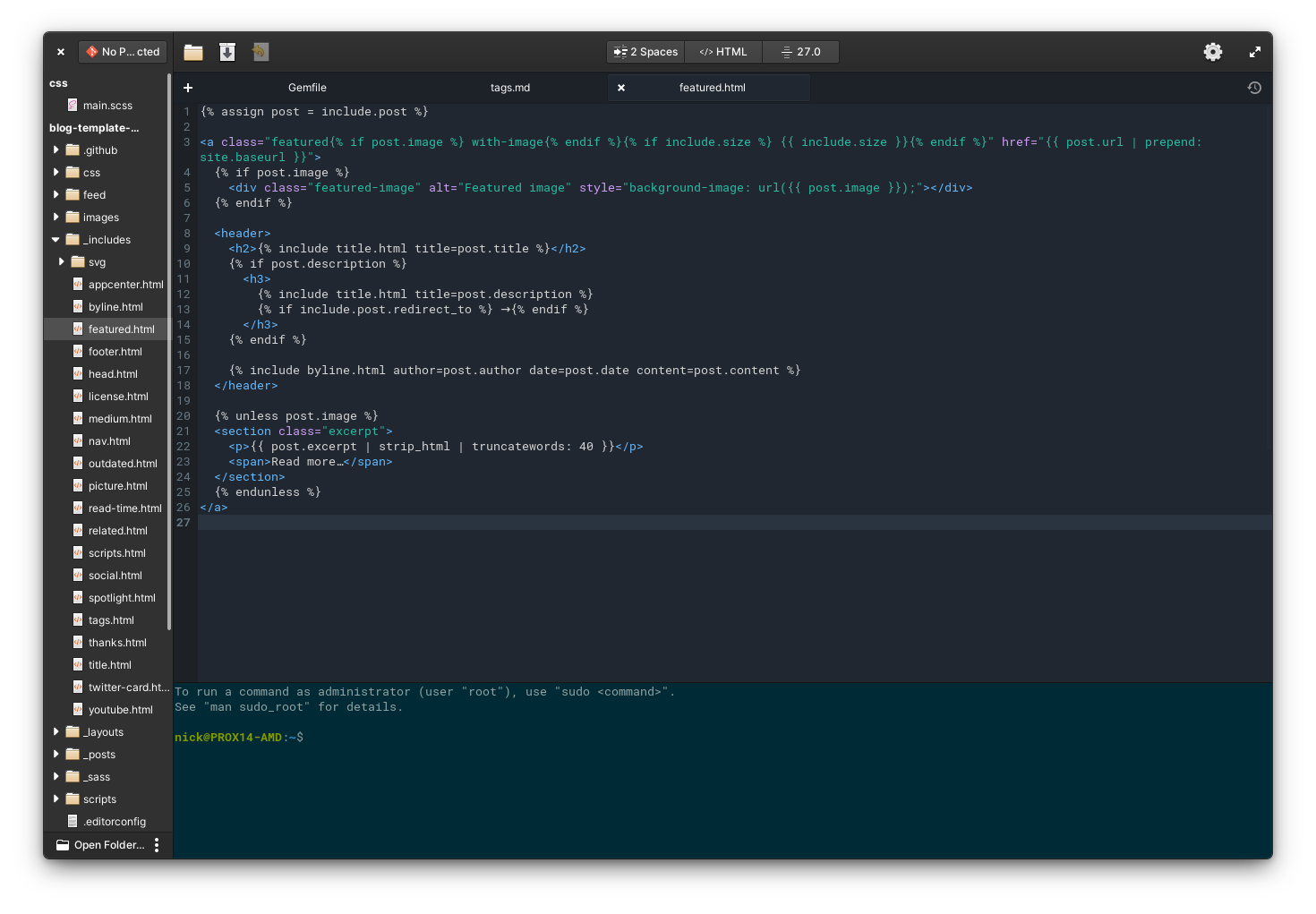
Code, the text editor / small IDE also got a few updates, with a full height project bar, moving the icons that were on that panel to the right of the window. It also now supports your system wide dark preference instead of only having manual options for light and dark theme, they added the find tools to the application’s menu, and they now support regular expressions, and selecting some text in a file will pre-fill the find tool with that text.
Hiding and showing panels is also now done from the app’s menu, and hidden folders will appear in your project tree automatically.
The Terminal also now can follow your system wide dark or light mode, but it lost its transparency by default, which I’m sad about, but it gained the ability to create custom color profiles, which is pretty great.
Finally, Archive manager and document viewer, both apps pulled from GNOME, received updates to their version 43, with better dark mode support and flatpak portals.
elementary OS apps received evolutionary changes, nothing will blow your mind compared to elementary OS 6, or even compared to what you might be used to in GNOME. They’re nice changes, but they won’t make your elementary experience any different.
Settings
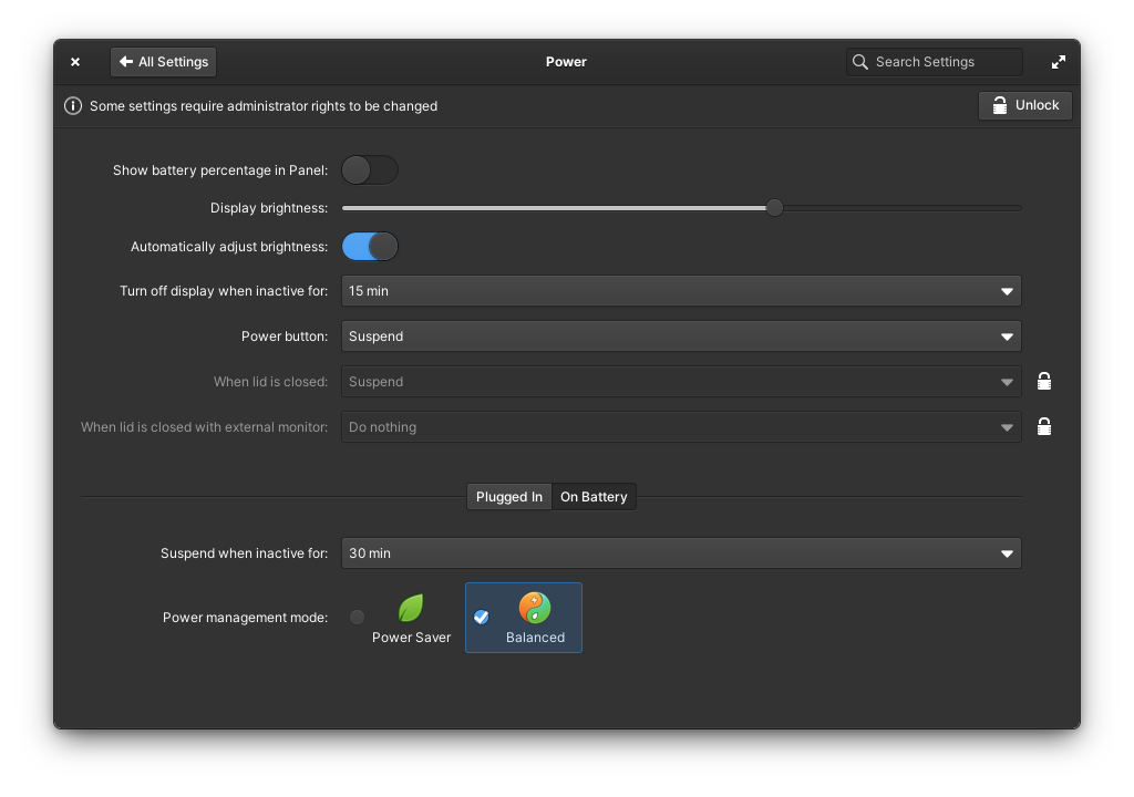
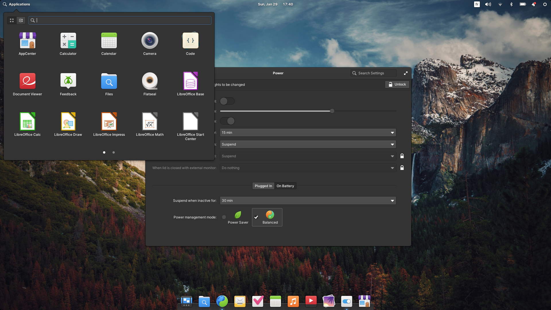
Let’s finish this with the settings. First, you now get power profiles, with a performance mode, power save mode, and balanced mode. Performance generally only appears on devices with a dedicated GPU, and on my laptop it’s not there, and you can’t switch profiles from the power indicator, which sucks, you’ll have to go into the settings themselves, but it’s still good to have these.
Hotcorners are also more configurable, in the multitasking preferences. You can now execute a custom command when activating one of these.
The keyboard shortcuts panel also is much better, letting you reset something to the default easily, and the shortcuts app can now be launched like any other application. More importantly, though, you can now easily set the super key to open the multitasking view, instead of either the shortcuts or the application menu.
I still wish the multitasking view had a launcher to type stuff and open apps or files, but it’s still just a window and desktop spread. It works well enough, but compared to the GNOME activity view, or the KDE overview, it now feels a little dated.
You also get cleaner printer settings with the ability to clear the print queue per printer, and it shows ink levels much more legibly.
And you get a new option in the security panel to prevent new USB devices from being mounted when the computer is locked.
Will I switching back?
So, is OS 7 enough for me to switch back? Well, let’s be brutally honest.
OS 7 feels amazing. The touchpad gestures are really great for navigating between apps, but also inside of apps, with the ability to go back from settings panels, from the app center, in the web browser, it’s all super smooth and responsive, and it’s on X11, not on Wayland.
OS 7 is as polished as ever, every detail is nicely crafted and looks great, and the attention to design, wording, placement is palpable, it’s what I always loved about elementary OS, and it’s still there.
But what elementary OS offers is now compared against other options that have matured way more quickly. Most of the advantages of elementary OS are now also present in GNOME and KDE, or they’re even better in these 2 desktops than in elementary.
These desktops have a better app ecosystem, they both support Wayland, their default apps have more features, they’re more configurable (even GNOME with its extensions) and they move faster as well in terms of updates.
I just feel that the elementary team is tackling too much at once: a distro, even based on Ubuntu, a desktop, and applications. it’s probably too much to be able to deliver significant updates to every component in a timely manner.
And there’s still the bone-headed decisions: no easy way to add Flathub in one click, no graphical access to Ubuntu repos by default, no way to add tray icons simply, no full system wide search for files, apps, folders, webpages, etc..
It feels like a foundation release: they cleaned things up, got ready for a GTK 4 transition, and maybe some Wayland work, but this means that what they delivered for a year of work since OS 6.1 just isn’t on par with what other desktops have done in the same time frame.
What were minor annoyances in OS 6 just feel like real blockers for me in 2023. And so, OS 7, while it’s probably going to be awesome for current elementary users, is simply not enough to pull me back in. Of course, I’ll miss the polish and the fantastic gestures, but the things that are missing are just too big to ignore.
Still, I like the experience, and I’ll wait and see how fast the desktop and the apps will get updated in OS 7 as it evolves over time, but for now, I just can’t see myself leaving GNOME or KDE on my laptop, or my desktop
Help support what I do
If you want to keep this website going, please consider subscribing on Patreon, you will get a bunch of cool advantages in the process, like a weekly podcast and the right to vote on video topics I cover on Youtube!


