Gnome is Great, But...
After using GNOME 3.34 for hours to make my latest video, I had time to reflect on what I feel is missing, and what GNOME's problems are.

GNOME 3.34 has been released yesterday, and it brings a ton of new stuff. Big performance improvements in the shell (thanks in part to Canonical), better wallpaper settings (you can actually see what your wallpapers are, and add your own), and a bunch of new features for the default apps.
It’s a great release, and I covered it all in a dedicated video on the channel, which you can find below if you haven’t seen it yet! (The video is sponsored by Skillshare, I highly encourage you to try their service, but if you’ve heard about them before, feel free to move to 2:00 to watch the video).
Now, I love GNOME. I use it everyday on Manjaro, and it’s my second favorite desktop environment (you can probably guess which one is my number one…). But I have some issues with it that were highlighted when I recorded that video.
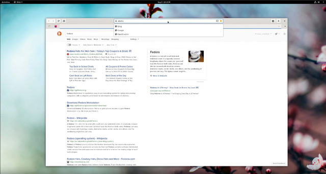
I recorded that whole video running Fedora Rawhide, the bleeding edge development release of the hat-named distro, which means I got as vanilla a GNOME as possible. I’m not used to vanilla GNOME, I’m used to GNOME + Dash2Dock, so let’s see what bothered me.
First, let me say that GNOME on Fedora is the fastest I’ve ever seen it. Even with Nvidia proprietary drivers installed (quite the chore to add them to Rawhide, by the way), it was extremely smooth, fast, responsive, and that’s running it from a USB3 SSD on my main and only desktop. It really is a very pleasing experience.
But there were some issues, at least what I perceive as issues. These might not bother you too much, but they kinda jumped at me this time around.
App management

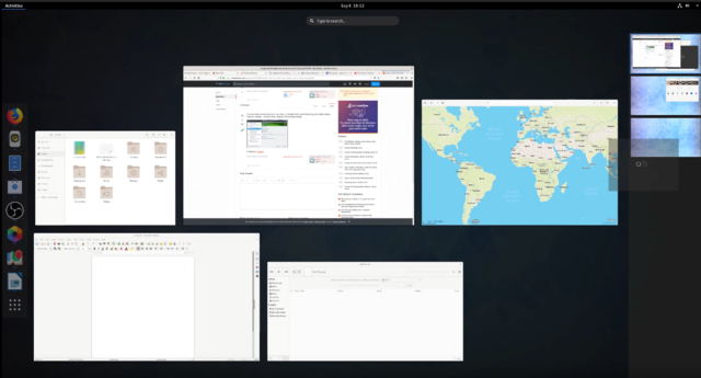
I’ll start with the main complaint people often level againt GNOME: no task / app management is visible by default. You can get used to that, by using alt+tab, or the activities view, but by default, there is no way to know which apps are running, on which desktop.
GNOME encourages you, through the removal of the minimize button, to spread your apps on multiple virtual desktops, which are created on the fly when you need them. It’s a good way to keep clean workspaces, but to see what is running where, you have to go to the activities view (a simple key press), and peek at the dock on the left side, or look at the virtual desktops on the right and figure out which windows are displayed.
It might not seem convenient just because I’m used to another way of app management, but it still seems less efficient to me to press a key than to look at an always visible dock or task list. You can get used to it easily, but going back and forth between Mac OS X at work, and a vanilla GNOME is hard. To sum it up, it’s not that GNOME’s way is wrong, it’s just that it’s so different than other desktops that it can get a bit jarring if you have to use multiple OSes during the day.
GNOME Apps are simple. That’s the good and bad news.

Next is the applications. GNOME apps are pretty simple, and often criticized for removing features instead of adding them. It’s not exactly true. Most of the time, it’s settings that are removed, not features, but I can see why that would rub people the wrong way. It’s not my issue here, what made me a bit uncomfortable is the pace of the evolution of these apps. If you can’t look forward to new features (because not many are added in each release), and the apps are already very simple, then what is the plan for this application suite ?
Each new release of GNOME adds a few new features, and 3.34 is no different. There are quality of life improvements in nautilus and the Terminal, last position conservation in Maps, Boxes is looking better and better every release, and Games, while it’s no Lutris competitor, is still a good game library manager. But all in all, these apps don’t evolve all that much.
Evince, the document viewer, is still incapable of reordering pages in a PDF to save it afterwards. You can’t select on which folder Nautilus opens new tabs, Music is still leagues behind Rhythmbox or Lollipop, and Notes is barely usable (IMO). Apart from Epiphany, which is moving faster than the rest, it seems these GNOME apps are evolving at a very slow pace, and that’s something I have a hard time living with.
There is nothing that I really miss using GNOME apps, and I can find easy workarounds, but they could be so much more practical and useful that it’s frustrating to see them carefully picking one or two “small” (at least in terms of user facing value, not judging the difficulty to implement these) new features and delivering these every 6 months.
Adwaita: if this is to be the default theme, it needs work

It’s no secret a lot of GNOME developers would like distros to stop theming their desktop and their apps. I can understand both sides of the issue, although I’m firmly in the camp of “themes are a crucial part of the Linux desktop and of a distro’s branding”. But if Adwaita is to be the default, it has to improve. The recent evolution of the icons is good. It’s subjective, but I find them modern, pleasing to look at, colorful, and easy to identify and read.
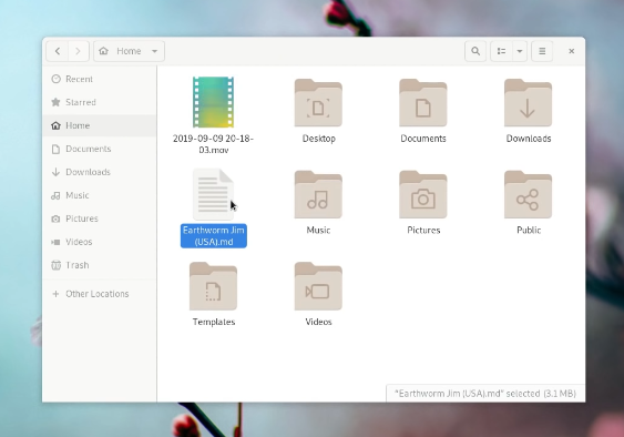
The GTK theme, on the other hand is (subjectively) not up to par. The wite and gray tones are hard to read, not very legible, and it’s tough to tell an inactive window from an active one. The menu highlights aren’t easily legible, and it’s still too padded and big to be really space efficient on a desktop, or a laptop.
If Adwaita is the future of GNOME’s looks, I feel it needs to be tweaked to be more legible, with better contrast, and better space usage. I realize it’s subjective, and maybe a lot of other people love and use Adwaita everyday, but I can’t, and I don’t feel it’s good enough yet to be pushed on all distros by default.
I love GNOME
These are my issues with GNOME. I still love that desktop, though. It’s gotten fast, to the point where I’ll treat any complaints on GNOME being bloated and unresponsive as a misguided continuation of a no longer valid assessment.
Its applications are basic, but simple to use, and coherent. Once you learn where the buttons and controls are on one, you know how to use them all, and that’s not a small feat. (Get it ? Feat ? Feet ? Okay, moving on).
I like where GNOME is headed. The headerbars are awesome, the simple and accessible feeling is great, the extension system, while it needs work to be more stable between releases, allows users to tweak their desktop quite a bit, and the developers actually started to lay down a vision for GNOME’s UX, which means they are still working on improving it and not resting on their laurels.
I’ve been a user of GNOME 2 for a long time. Then Unity came around, and while the shell was different, the apps were mostly GNOME’s. Then Pantheon came into my life, and while the default apps were different, I still used a ton of GNOME 3 apps, which never looked out of place on elementary OS. And finally, I moved to Manjaro GNOME, and, apart from a dock and a minimize button, I have no other extensions.
GNOME still gets a lot of hate online, and I understand why people might not like its way of doing things, but let’s be honest: it’s the default for the major Linux distros, and there’s a reason for that. But some of these major distros still ship it with extensions or tweaks, which lets me think GNOME isn’t fully there yet. Ubuntu adds a dock, Manjaro adds a dock and a minimize button, and “only” Debian, Fedora and OpenSUSE seem to ship a vanilla GNOME.
I love GNOME, it’s fantastic, and I’m glad it’s around. But like most other pieces of software, it still needs a bit of work to truly shine.
Help support what I do
If you want to keep this website going, please consider subscribing on Patreon, you will get a bunch of cool advantages in the process, like a weekly podcast and the right to vote on video topics I cover on Youtube!


